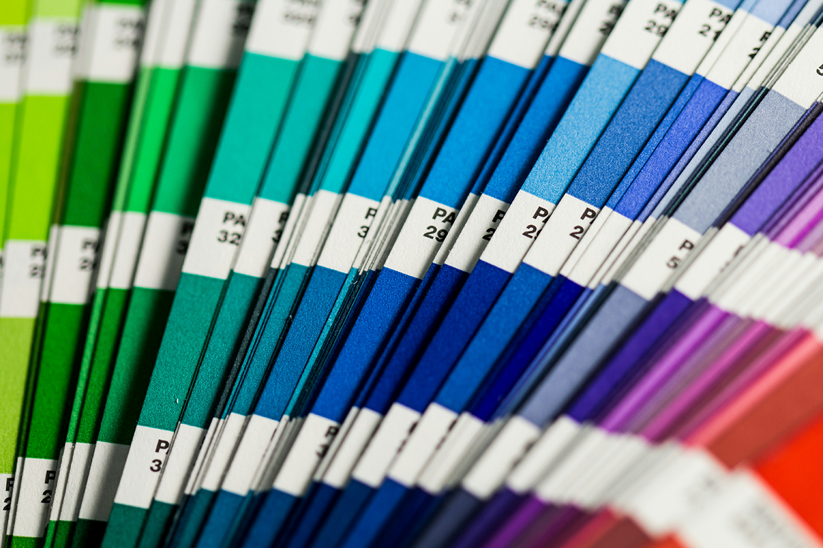
Color Theory: What Your Brand Colors Say About You
Let’s talk about color—because your brand’s color palette is doing a lot more than just looking pretty. Whether you carefully selected your colors with strategy in mind (gold star for you!) or just picked your favorites on a whim (we’ve all been there), your brand colors send a message. And that message better be the right one.
So, what do your colors say about your brand? Let’s break it down.
Red: Bold, Passionate, and Ready to Take Over the World
Red is the color of energy, excitement, and, let’s be honest, a little bit of urgency (ever noticed all those red SALE signs?). Brands that use red want to stand out, be bold, and make an impact. If your brand is all about confidence, power, and passion, red might be your best friend.
Examples: Coca-Cola, Target, YouTube
Blue: Trustworthy, Professional, and the One Everyone Can Count On
Blue is basically the responsible adult of the color wheel. It’s calm, dependable, and makes people feel safe—hence why banks, healthcare companies, and tech brands love it. If you want your brand to scream “You can trust us,” blue is a great choice.
Examples: Facebook, PayPal, IBM
Yellow: Happy, Optimistic, and Full of Sunshine
Yellow is bright, cheerful, and full of energy. Brands that use yellow want to radiate positivity and friendliness. But use it wisely—too much yellow can feel overwhelming (or like a highlighter exploded on your screen).
Examples: McDonald’s, Snapchat, IKEA
Green: Fresh, Natural, and All About Growth
Green is associated with nature, health, and wealth. If your brand is eco-friendly, wellness-focused, or all about growth (financial or otherwise), green is a strong choice.
Examples: Whole Foods, Starbucks, Spotify
Black: Sleek, Luxurious, and a Little Mysterious
Black is all about sophistication, elegance, and modern minimalism. It’s often used by high-end brands that want to give off an exclusive, timeless vibe. Bonus: black goes with everything.
Examples: Chanel, Nike, Apple
Purple: Creative, Luxurious, and a Little Bit Royal
Purple has long been associated with royalty and wealth, but it’s also the color of creativity and imagination. Brands that want to feel unique, innovative, or even a little mystical gravitate toward purple.
Examples: Cadbury, Hallmark, Twitch
Orange: Energetic, Playful, and a Little Bit Quirky
Orange is fun, lively, and not afraid to stand out. It’s a great choice for brands that want to feel approachable, adventurous, and a little unconventional.
Examples: Fanta, Harley-Davidson, Nickelodeon
Pink: Playful, Feminine, and Fun
Pink can be soft and romantic or bold and rebellious, depending on the shade. It’s often used by brands that want to feel youthful, energetic, and modern.
Examples: Barbie, T-Mobile, Victoria’s Secret
So, What’s Your Brand Saying?
Your brand colors are more than just a design choice—they’re part of your brand’s personality. Choosing the right colors can help you attract the right audience, create emotional connections, and make your brand instantly recognizable.
Need help figuring out your brand’s perfect color palette? Let’s chat—I’d love to help you bring your brand’s personality to life with the right colors.
What’s your brand color, and why did you choose it? Drop me a message and let me know!
Photo by Christina Rumpf on Unsplash
